
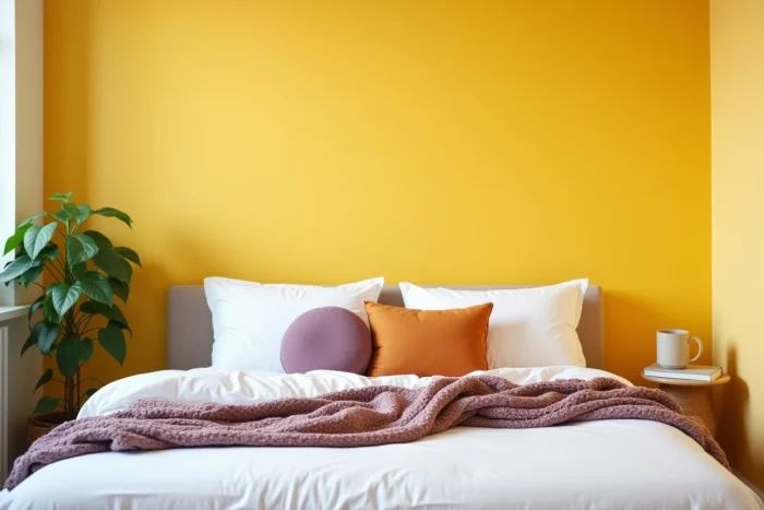
Lemon yellow is a shade that polarizes. On a south-facing wall, bathed in direct light, it radiates effortlessly. Placed in a north-facing room, it can turn greenish or appear dull as soon as the sky clouds over.
The complementary color of lemon yellow on the color wheel, purple, poses a symmetrical problem: it absorbs light instead of reflecting it. Working with these two shades together in an interior requires considering the orientation of the room, the type of lighting, and the proportions of each color.
See also : Discover how to easily organize your sports activities with a dedicated platform
Lemon yellow in north-facing exposure: why standard purple darkens the room
The color wheel designates purple as the direct complementary color of yellow. In theory, the contrast between the two creates a strong visual vibration. In practice, in a north-facing interior, natural light is cool and diffuse, with little direct rays. Purple, which already absorbs a large part of the light spectrum, loses all depth under these conditions.
The result is a space that seems smaller and darker than it is. Lemon yellow does not compensate: it needs light to express its saturation. Without it, it leans towards a dirty yellow, almost olive.
Recommended read : How to Effectively Digitize Your Documents with Electronic Management
To pair a complementary color with lemon yellow in this context, the purple shade should be shifted towards lighter or warmer tones: a lavender mauve, a desaturated lilac, or even a rosy lilac. These variants maintain the principle of complementary contrast while reflecting more light.
60-30-10 rule applied to lemon yellow: balancing the accent without overwhelming
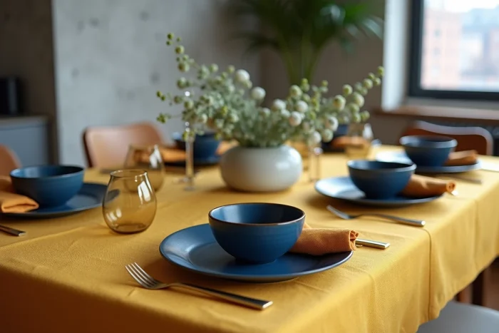
The 60-30-10 distribution remains a reliable guideline for integrating a bright color without disrupting a room. Lemon yellow works as an accent at the lowest slice, around the smallest proportion of the palette. Lemon yellow as an accent avoids the visual saturation that results from its use as a wall flat.
Field reports confirm this approach: on a balcony or a small south-facing space, lemon yellow in small touches (cushions, vase, frame) energizes the atmosphere. In contrast, an entire wall painted lemon yellow in a small space creates visual aggression, especially at the end of the day.
Concrete distribution for a living room
- The dominant color (walls, floor, large sofa) remains neutral: off-white, light gray, sandy beige. It occupies the majority of the visible surface.
- The secondary shade, about one-third of the decorative elements, can be a teal, a sage green, or an anthracite gray, depending on the desired effect.
- Lemon yellow comes in last: an accent chair, cushions, a light fixture, a framed artwork. A few objects are enough to anchor the color in the room.
This structure also works in a bedroom or kitchen. The principle remains the same: lemon yellow gains impact when it remains rare in the space.
Artificial lighting and lemon yellow: the trap of warm white
A rarely discussed point in decor guides concerns the interaction between lemon yellow and LED lighting. Warm white bulbs, around 3000 K, add a yellow-orange tint to the ambient light. Combined with lemon yellow in a textile or on a wall, the 3000 K LED produces a fluorescent effect in the evening, particularly in west-facing rooms that also receive sunset light.
This phenomenon makes lemon yellow difficult to live with after a certain hour. The shade becomes aggressive, almost acidic, instead of remaining fresh.
What lighting alternatives to prioritize
Lighting around 3500 K to 4000 K (neutral white) preserves the vibrancy of lemon yellow without overheating it. For rooms where warm white is still desired for comfort, the compromise is to keep direct light sources away from yellow surfaces. Indirect lighting directed towards the ceiling or neutral walls reduces the effect of overexposure.
In north-facing spaces, where natural light is lacking, the choice of bulb color temperature becomes as crucial as the choice of paint itself.
Teal and lemon yellow: a duo that works in low light
Among the alternative associations to the yellow-purple couple, the duo of lemon yellow and teal offers a strong contrast without the disadvantages of light absorption from purple. Teal reflects enough light not to dim the room, even in north-facing exposure.
Teal is a deep blue-green, more saturated than navy blue but less dark. Paired with lemon yellow, it creates a readable warm-cool contrast that does not depend on generous sunlight to exist. A teal velvet on a sofa, facing lemon yellow cushions, works just as well under a cloudy sky as under bright light.
Why this duo holds better than yellow-purple in dark interiors
- Teal has a higher light reflectance index than deep purple: it sends more light back to the eye.
- Its green component tempers the coolness of pure blue, preventing too harsh a contrast with lemon yellow.
- It integrates easily into a neutral environment (gray, white, light wood) without imposing a particular decorative style.
Purple remains relevant in well-lit rooms. For low-light interiors, teal is a more reliable substitute complementary color.
The choice of a complementary color to lemon yellow is not limited to a reading of the color wheel. The orientation of the room, the temperature of the bulbs, and the proportion of yellow in the space radically alter the result. Testing a paint sample on-site, at different times of the day, remains the only way to validate an association before committing.